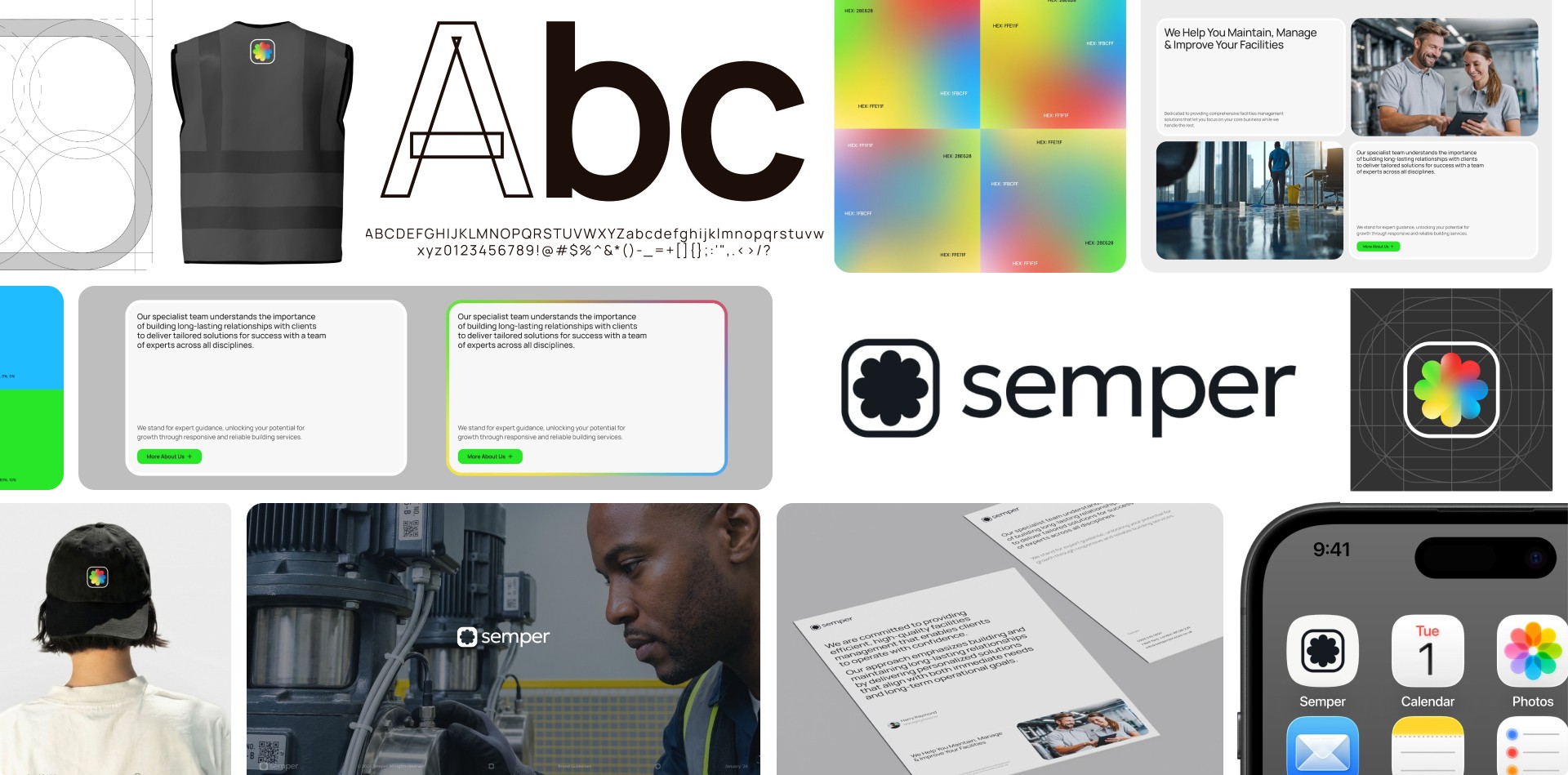
Inspired by precision engineering and modular systems, the visual identity for Semper, a global facility management company, was designed to express strength, clarity, and adaptability. The structured logo mark symbolizes continuity and interconnected systems, while the balanced geometry evokes stability and trust across complex environments.
The brand system is rooted in consistency, technical expertise, and human-centered service. It combines industrial neutrality with modern design minimalism, ensuring both professionalism and approachability. From the logo, typography, and color system to the digital interface and brand applications, every detail reinforces operational precision and global capability.
